We all get in a mood sometimes. And sometimes what causes us to feel “grrr” or “ahhh” can partly depend on what color of the rainbow we happen to be looking at.
The color on the walls in your home that you’re surrounded by for hours on end probably have more of an effect on how you feel than you might think. So you’re going to want to put some serious thought into the color you paint them and the emotions you want to evoke.
To help, here’s a deep dive into the science and psychology of color, with insights from design experts on the ideal colors for your entire home, room by room.
The science of color
Color theory is the science of what feelings your brain connects with various colors.
For instance, our brains associate warm colors—think red, orange, and yellow—with feelings like passion, comfort, anger, and power, according to Neurofied, a brain and behavior consultancy firm.
And on the other side of the spectrum, cool colors (blue, green, and purple) have the opposite effect, creating a calming atmosphere that counteracts feelings of anxiety.
So whether you’re thinking about remodeling for a potential home sale or looking for a way to make your kitchen feel warmer, your bedroom more serene, or your home office more productive, read on.
Here’s what color to paint each room in your home.
The primary bedroom
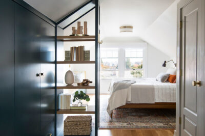
Photo by Casework
In a perfect world, your bedroom should be a place of calm and refuge. So why not help nudge it there with the right hue?
“Soft blues, gentle grays, and muted greens are great choices for primary bedrooms, and they’re popular now,” says Artem Kropovinsky, an interior design expert and founder of the New York–based design studio Arsight. “They evoke a sense of tranquility and restfulness, ideal for a space meant for relaxation and rejuvenation.”
What the science says: Blue has been shown to lower blood pressure and help you get a great night’s sleep.
The home office
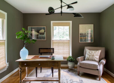
Photo by Powell Brower Interiors
When you’re working in your office at home, efficiency—and not getting distracted by what’s happening in the rest of the house—is key.
“Choose focus-enhancing colors like soft greens or earthy browns,” Kropovinsky advises. “These can aid concentration and reduce eye strain. They also create an atmosphere of calm productivity.”
What the science says: Simply being around the color green can boost mental functioning and even your physical well-being, according to an analysis published by the American Psychological Association.
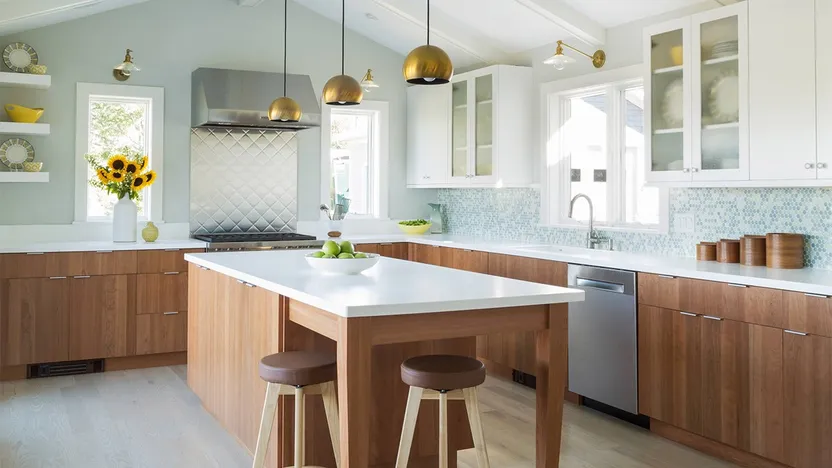
The kitchen
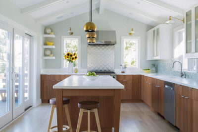
Photo by Ellen McKenna Design
The kitchen is the place where you want everyone to feel comfortable and taken care of—so go with a color that evokes an embrace.
“You want the kitchen to be inviting,” says Erin Banta, co-founder of Pepper, a home goods company. “Ideally, the kitchen should be painted warm colors, like a soft yellow.”
What the science says: Yellow is generally associated with energy and positive feelings, according to color theorists. But gentle blues or light greens can also be great if you want to infuse the space with calm and positivity.
The living and family room

Photo by GO LOGIC
Think neutral colors when it comes to your home’s most social spaces.
“In living and family rooms, I always advise people to go for warm neutrals,” says James Donald, founder of Aesthetic Paints, based in Mattie View, AZ. “Greens and light browns help establish a connection with nature and foster tranquility. They are also versatile and go with a variety of decors.”
What the science says: Color theorists link brown to strength and reliability, but only in lighter tones. Too much dark brown is associated with negative emotions, so keep your walls light.
The nursery
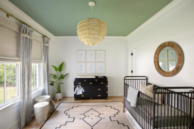
Photo by JLV Creative
Serenity. Now. Nurseries should be bastions of calm—so no loud voices or colors, please.
“Soft pastels work in the nursery because they create a soothing environment for you and the baby,” says Donald. “Light shades of pink and blue can be used to promote a sense of serenity. Avoid stimulating or even bold colors, which may subtly disrupt sleep patterns.”
What the science says: Pink is associated with love, kindness, and calm. In fact, it’s so effective, a prison in Switzerland has experimented with housing aggressive inmates in pink rooms to calm them down.
The bottom line on paint colors
While it is never a bad idea to keep your finger on the pulse of paint trends (warm green tones, neutrals, and inventive gray hues are red-hot interior paint colors this year), in the end, you have to be true to yourself.
“Picking paint colors for future buyers really takes the fun out of decorating,” says Melanie Thomas, an interior stylist based in Los Angeles. “As a former house flipper, I can attest that there is no telling what the future homebuyer will want and will most likely change everything once they move in.”
Thomas’ advice: “Paint to your heart’s content—especially if you plan on living in the current house for more than a year.”